

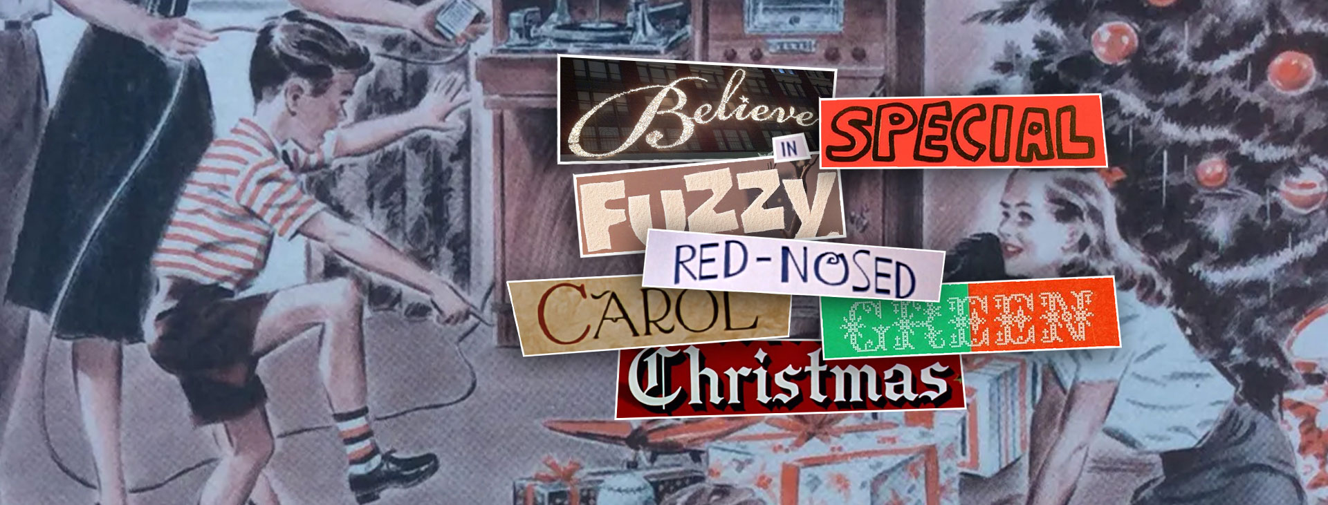
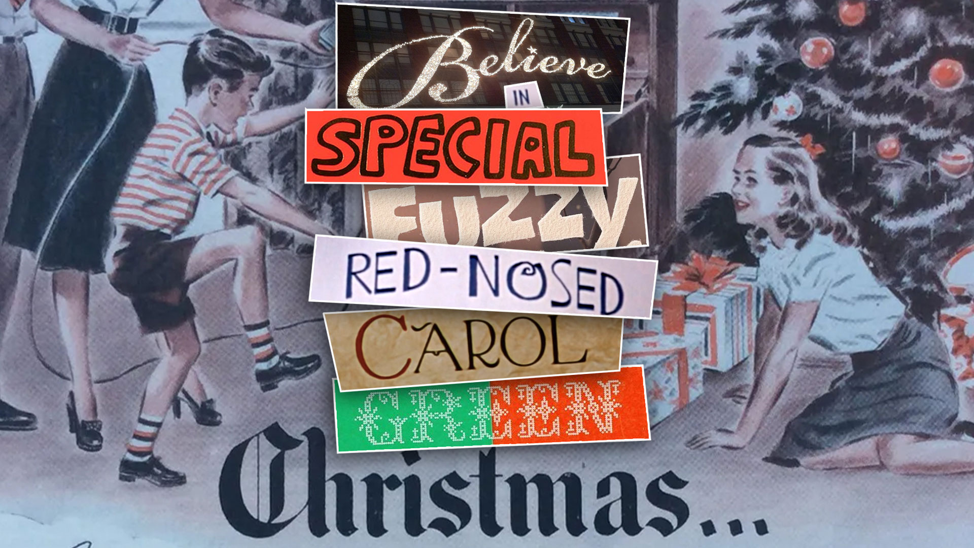
What better way to capture the essence of Christmas in design than with the perfect holiday font?
Typography has been an essential part of the holidays since Medieval times. Type is a way of evoking sentimentality and having a lasting effect on consumers: think of how you feel when you see that signature script on the opening credits of your favorite holiday movie, or when you notice a Christmas card that just speaks to you—even if the words aren’t that special. Let’s look at some of the most iconic festive typefaces and where you may have spotted them before.
Whimsical Script
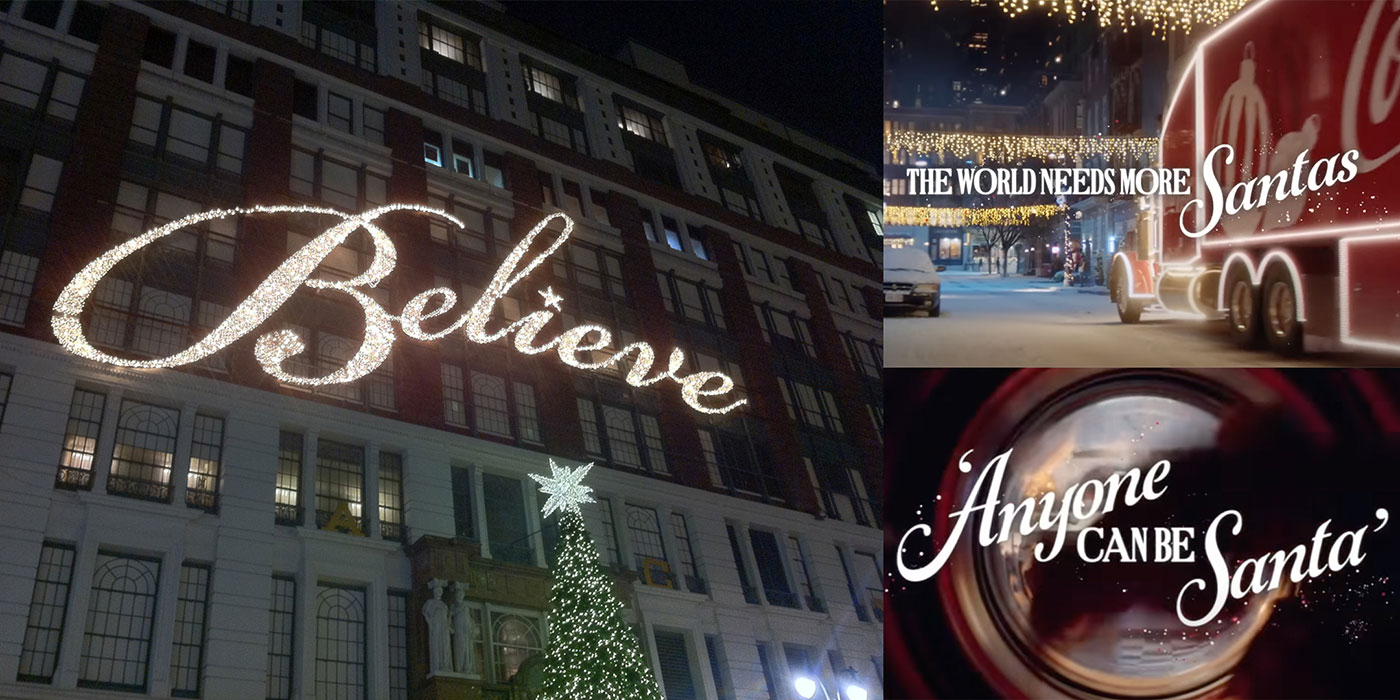
When it comes to evoking sentimentality, cursive-style type always feels personal in some way. Macy’s Believe and Coca-Cola’s The World Needs More Santas campaign are great examples of type treatments that create movement and bring a sense of wonder to the viewer. The beautiful, flowing Bickham Script adds a signature flourish and a touch of Christmas magic in Believe. Coca-Cola chose Gioviale for their campaign line, a font that blends italics and script for an elegant and nostalgic design.
Limerick
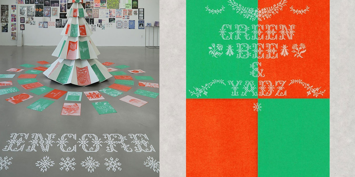
From holiday sweaters to personalized handmade keepsakes, cross-stitch lettering has become increasingly popular through the years. There are a multitude of different typefaces that emulate the look of stitching, including Limerick, a pixel font that’s digital and modern while maintaining that classic embroidered pattern.
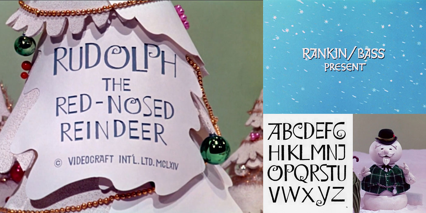
Rudolph The Red-Nosed Reindeer
One of the most beloved Christmas characters is Rudolph the Red-Nosed Reindeer who first came to screen in 1964. Every year since then, we’ve gotten to see the fun title sequence build in with hand-drawn lettering made with thick and thin strokes, curly accents, slightly rough edges, and an uneven playful baseline. The source of the design is taken from the typefaces Lawless (1961) and Weiss-Initialen (1931).
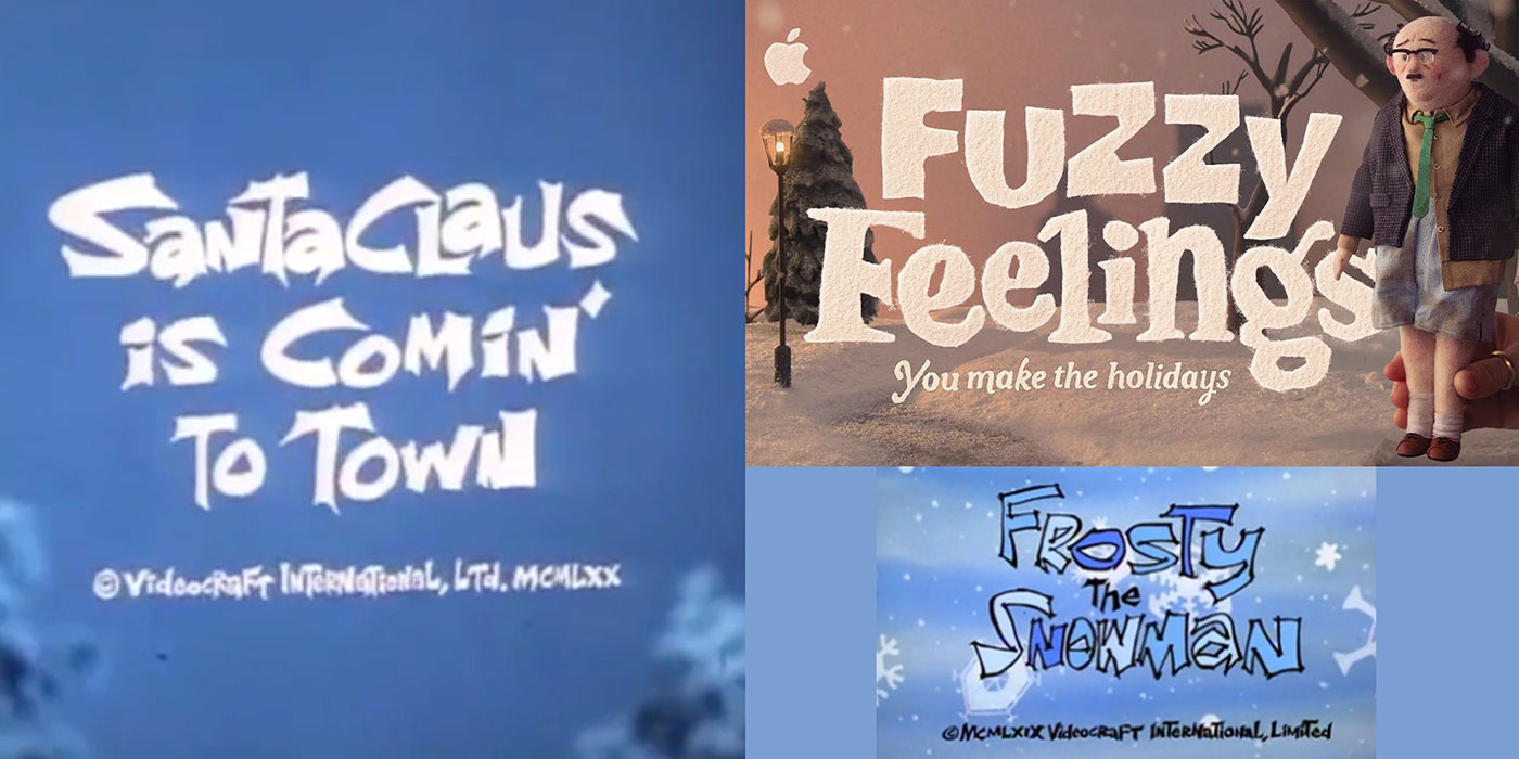
Hand Crafted
Whether it’s a classic Rankin/Bass animated special or a new holiday ad from Apple, handcrafted type is abundantly everywhere and for good reason. With its own uniqueness and attractive style, handcrafted lettering helps build a personal connection with the viewer (and makes them more inclined to purchase the latest iPhone!).
Old English/Blackletter
Old English and Blackletter typefaces are heavy hitters around the holidays, with their classic and traditional style dating back to the Medieval and Victorian eras. Sturdy, elegant, and regal, these two fonts are a perfectly timeless choice for holiday designs.
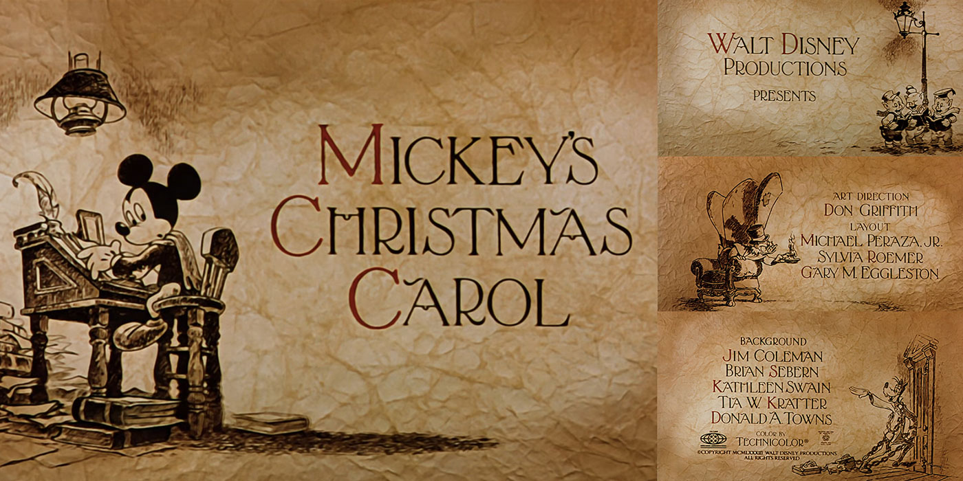
Mickey’s Christmas Carol 1983 (opening titles)
One notable opening sequence is one of the many versions (and often a family-favorite version) of Charles Dickens’ A Christmas Carol, Mickey’s Christmas Carol. The thin serif styling of thick and thin strokes paired with subtle flourishes work well to complement the black inked illustrations. The typeface, which is a variation of Marquis, brings a traditional charm and sophistication that pays homage to the Victorian era & Charles Dickens with its design.
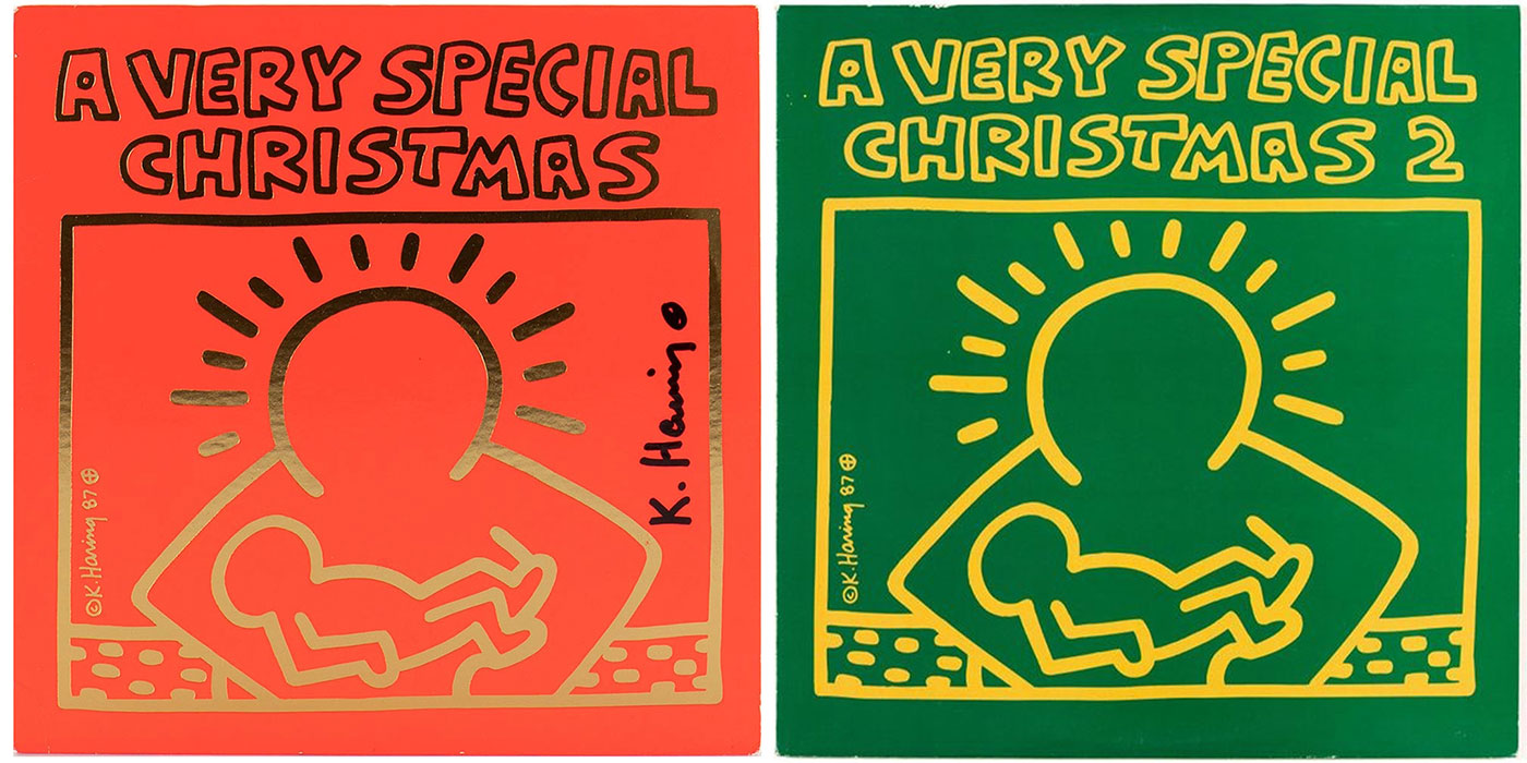
Keith Haring
Christmas wouldn’t be Christmas without the music. One album that stands out is A Very Special Christmas: a compilation of Christmas carols and holiday songs by various artists that raised money for the Special Olympics. The iconic cover artwork was designed by Keith Haring. Along with his illustrations, his hand lettering adds a personal touch and creates an energy that complements the music within the album.
With so many iconic fonts to play with around the holidays, it can be hard to pick a favorite—luckily, there’s plenty of opportunity to see and use them all. Whether you use Old English for a custom holiday card and Gioviale for a new ad campaign or mix and match fonts for a tacky Christmas sweater, the holiday season is a favorite (and forgiving) time of year to let yourself go and explore with type.