
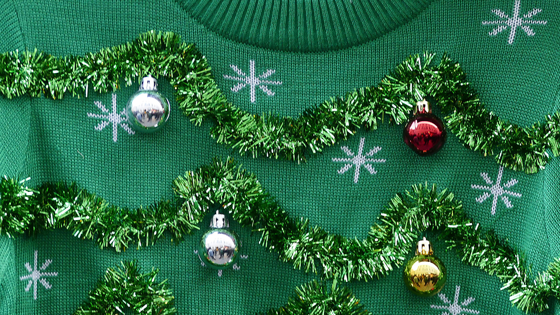
From ugly sweaters to tacky tinsel, it seems like “Christmas design” is destined to be gaudy and loud at best. The signature red and green (and sometimes silver and gold) color palette gives creative license to clash colors, mix fonts, and completely abandon any “stylistic rules” we abide by year-round. There are so many different aesthetics for the holidays—traditional, modern, monochromatic—and all together it’s mishmash. But is there a way to create elevated seasonal content and designs, without going cliché?
Christmastime gives everyone a chance to express their ideas creatively through décor, design and branding—so, naturally, not every execution is cohesive or successful. We can end up with ultra-kitchy designs based on puns or inappropriate jokes. But leaning into specific graphic elements can yield beautiful results.
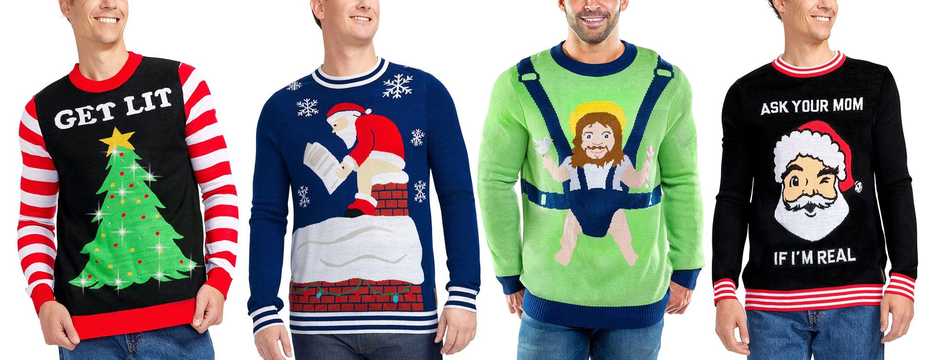
Ugly sweaters courtesy of Tipsy Elves
For example, there are typography styles and timeless hand-crafted, hand-painted holiday motifs from the 1930’s and 40’s that can add a sense of nostalgia and keep designs simple. The vintage style of Coca-Cola Christmas ads has become a classic Christmas look and feel. One of our own holiday cards even tapped into the “classic Santa” image, while putting a unique and nondenominational spin on him.

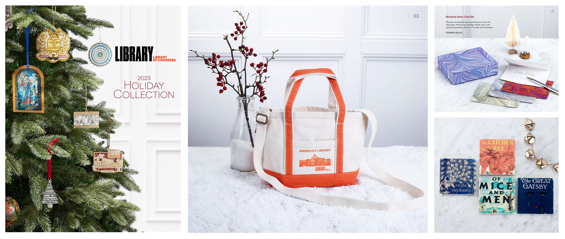
It can also be quite successful when people deviate from traditional themes to create ultra-modern designs. Experimenting with pastels, going monochromatic, or using unconventional material to achieve a streamlined look. In this holiday products catalog for The Library of Congress, for example, a cohesive winter-white theme is carried through using classic marble and touches of snow, while adding subtle pops of red with holly for a modern and clean seasonal look.
Some brands opt to stay true to their own aesthetic, and instead turn to subtlety to convey the spirit of the season; in their 2023 end-of-year giving campaigns, March of Dimes relied on language, rather than design elements, to capture the feeling of Christmas.

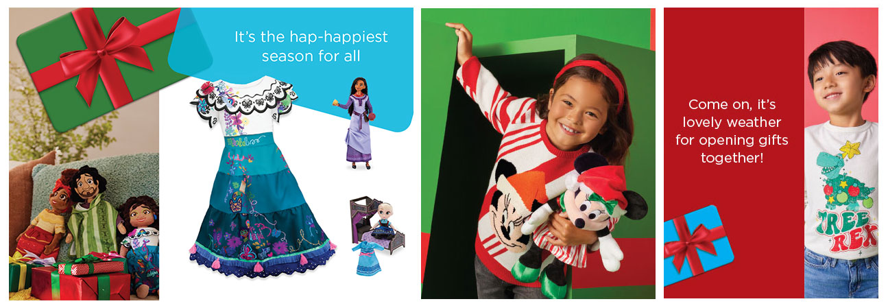
Other brands fully embrace the spirit of Christmas and turn to referencing song lyrics in copy and clever phrases to conjure nostalgia during the holidays. When promoting shopDisney for the holidays, Disney Rewards relied on lyrical seasonal copy paired with bold festive design elements to encapsulate the magic of Christmas.
Ultimately, it’s unfair to call Christmas itself bad design—more likely, it’s a season that has resulted in a multitude of bad designs. Who’s to blame? Maybe Coca-Cola. Maybe consumerism as a whole—the desire to commercialize and capitalize on the feeling of the holidays: sheer happiness and a desire to buy and give. And maybe that “feeling” is red and green: but maybe, just maybe, brands and designers can change those colors without losing the joy and wonder of Christmas.

