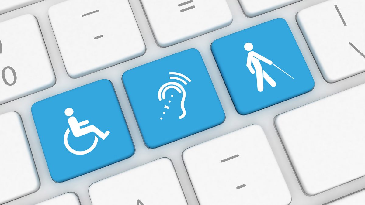

When it comes to digital content, creators and users have different measures for success. As an advertising agency, we have a responsibility to our clients to ensure their content earns impressions and clicks. However, we also have a responsibility to our audiences, to ensure that content is accessible to them.
The Internet can present more obstacles than access points, especially for users with disabilities. Any number of disabilities, whether visual, auditory, cognitive or physical, can affect how people access content online. Digital content that ignores accessibility does a disservice to disabled users and to itself.
“The advertisement industry often speaks on ‘target audience,’” says Alexis Hancock, our Senior Web Developer. “But if your website or ad has low accessibility, then you will never truly reach the highest amount of people you can with your message.”
We don’t always reach our accessibility goals. But we keep striving—in our client work and here on our website—because accessibility is the foundation for effective digital campaigns.
Building without barriers
Accessible development is the practice of building over, under, around and through the barriers that prevent disabled people from access, interaction and contribution. These inclusive principles are the same online as in the physical world.
“Most of my life I thought of accessibility as a background issue,” Alexis explains. “It wasn’t until 2010—I had knee surgery and couldn’t walk for two months—I began to realize how hard my campus was to navigate on a daily basis if I couldn’t walk on my own. I carry that time with me into making websites accessible for everyone.”
Informed by her experience, Alexis leads our development team in making digital spaces as accessible as possible. On her college campus, accessibility features may have included ramps, Braille signs and audible crosswalk signals. Similarly, accessibility features in her code can include:
- Semantically meaningful HTML, like alternative text descriptions for images and intuitive link naming, both of which help people with visual impairments using text-to-speech software or text-to-Braille hardware.
- Closed captions for video and audio, which make media more accessible to people with hearing impairments.
- Large clickable areas for links, which improve access for people with movement conditions that affect mouse use.
- Assistive scripts and quick links that respond to the Tab key, which help keyboard-only users navigate sites more quickly.
According to the World Wide Web Consortium (W3C), accessibility features like these often improve site usability for users of all abilities.
Design with access in mind
In recent years, some unlikely leaders have emerged in accessible web development: governments. That’s thanks to legislation prohibiting discrimination on the basis of disability. In the U.K., the Equality Act 2010 led to the redesign of the government website. The result, Gov.UK, is so streamlined and functional that London’s Design Museum awarded it 2013 Design of the Year.
The site offers guidelines for other digital content creators, on a page called “Making your service accessible: an introduction,” which includes suggestions like:
- Think about accessibility from the start.
- Research with users with disabilities.
- Explore user abilities and disabilities during discovery.
- Design for accessibility in alpha.
- Test for accessibility in beta.
- Keep testing once your service is live.
Most web developers are familiar with the Web Content Accessibility Guidelines (WCAG 2.0), the standards for accessibility set by the W3C. But Gov.UK advises everyone on a digital content team—not just developers—to familiarize themselves with these standards.
“Accessibility isn’t the responsibility of just one person. Everyone on your team is responsible for making sure your service is accessible.”
Our accessible development in action
What does full-team collaboration on accessibility look like? For one of our client teams at True North, it looked baby blue at first. Our client was undergoing a brand redesign. When they presented us with the updated color palette, we noticed a problem. They had selected a light blue that was difficult to distinguish from a white background. We used a contrast testing tool and confirmed it wasn’t ADA or WCAG 2.0 compliant. Alexis’ team caught the problem in time, allowing our creative team to correct the color palette before the campaign went live.
“By having the technical team involved in the conversations early while assessing potential work,” Alexis explains, “it helps not only guide specs, but it alerts to developers any possible barriers to access.”
This accessibility-first strategy also fosters innovation. Alexis and her team often employ HTML markup labeling like WAI-ARIA tags, which give disabled users greater control over rich media and dynamic content. This allows them to create truly interactive user interfaces, without sacrificing accessibility.
Alexis’ tips for an accessible workflow
Accessible web development is an all-hands-on-deck process that requires ongoing education.
For web developers, Alexis recommends:
“Watch out for all types of accessibility issues that may not be on the forefront,” she adds. That includes things like monitoring WYSIWYG editors for junk HTML and ensuring session times are long enough that users with limited mobility can complete a form before it times out.
For content creators and designers, Alexis recommends:
- “Inclusive Front-End Design Patterns,” a book by Smashing Magazine
- Mozilla Developer Network Accessibility Guidelines
- Mozilla Developer Network Guide to HTML
She also cautions creators against common pitfalls, like complicated designs that are more impressive than effective. Success in accessible development is not simply the absence of barriers though. It’s also the presence of awesomely accessible features.
“Go beyond thinking of accessibility as a check mark,” Alexis says, “and start thinking of it as a goal post.”
- https://en.wikipedia.org/wiki/Web_accessibility
- https://www.youtube.com/watch?v=3f31oufqFSM
- http://gov.uk
- https://www.gov.uk/service-manual/helping-people-to-use-your-service/making-your-service-accessible-an-introduction#what-to-do-in-discovery
- http://www.wired.co.uk/article/design-of-the-year
- https://www.w3.org/TR/WCAG20/
- http://accessible-colors.com/
- https://developers.google.com/web/updates/2018/01/devtools#a11y
- https://addons.mozilla.org/en-US/firefox/addon/axe-devtools/?src=collection
- http://wave.webaim.org/
- https://www.smashingmagazine.com/inclusive-design-patterns/
- https://developer.mozilla.org/en-US/docs/Learn/Accessibility
- https://developer.mozilla.org/en-US/docs/Web/HTML
- http://www.washington.edu/accessibility/checklist/
- https://www.linkedin.com/pulse/wcag-scary-anymore-progressive-approach-website-herin-hentry/
- https://bitsofco.de/the-accessibility-cheatsheet/

