


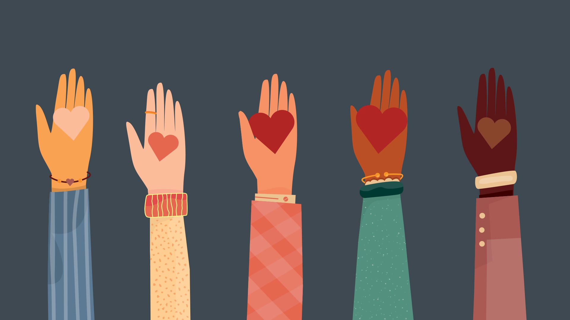
A successful nonprofit is ultimately a test of trust: how much do donors trust that their money is being used for good, and how confident are they in the cause they’re supporting? There’s no way to convey that trustworthiness without a strong brand.
That was the central theme of our latest RØMP challenge: Your Cause.
Each member of our creative team (the “Makery”) had the opportunity to create their own nonprofit — branding and all. Our Makery members had the chance to explore their personal passions and bring them to life with their imaginary funding. Researching the need for each nonprofit was the first step. Next was deciding how that nonprofit should show up in the world: deciding on the name, colors, logo, brand tone, and more.
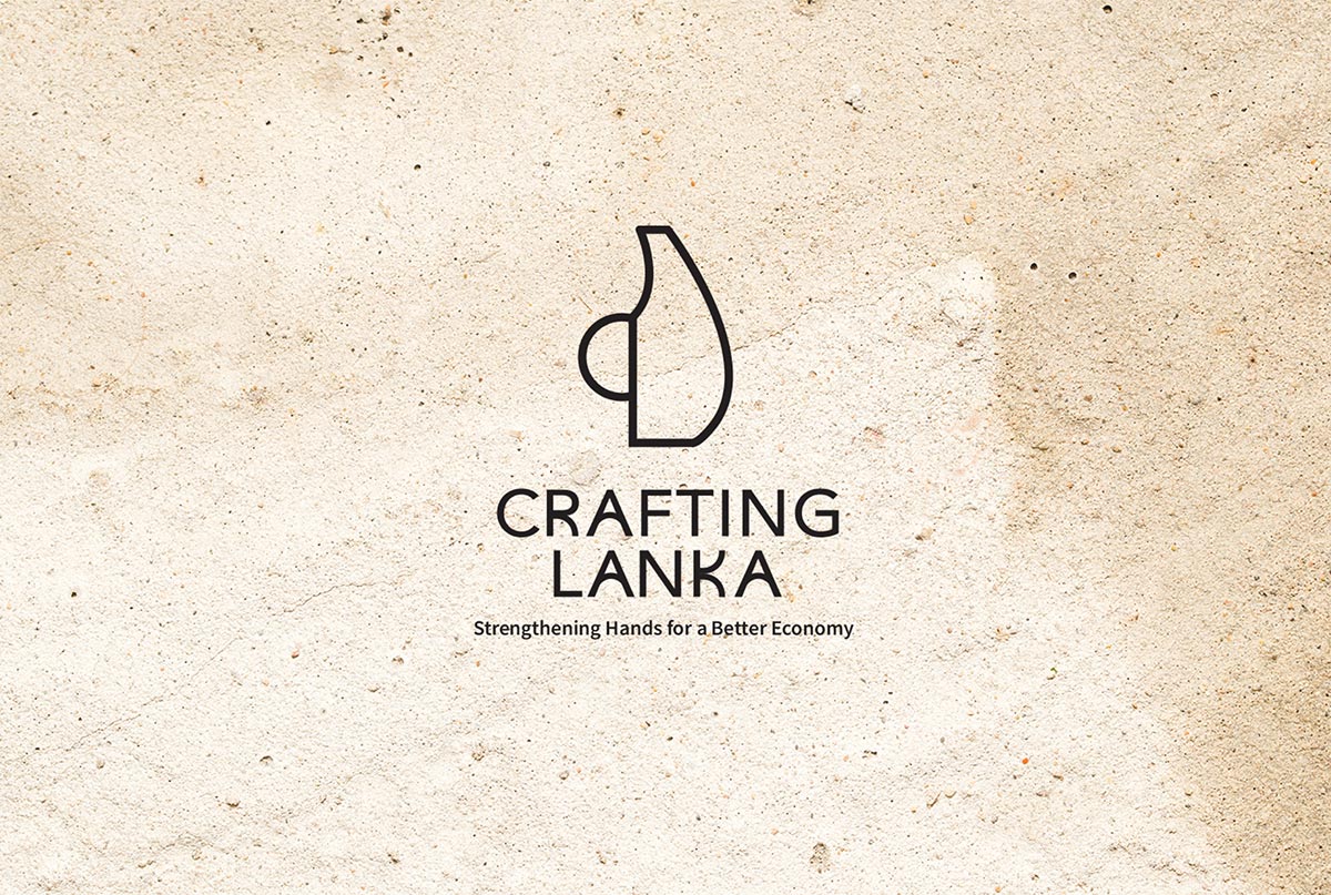
Personal causes ranged from youth-focused to international affairs, with one project — called Crafting Lanka — focusing on simultaneously building the economy in Sri Lanka for the future while getting the country out of a major debt crisis. The logo combined the shape of the country with the silhouette of a handcrafted item, alluding to the tactical nature of the charity: helping provide the platform to sell handmade goods internationally to alleviate Sri Lanka’s foreign debt.
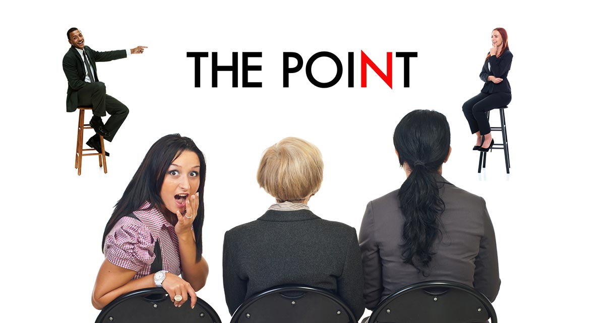
Two projects focused on information accessibility, with the need for “anti-propaganda” being the driving force behind each. The first, The Point, was dedicated to everyone having the right to safe and thoughtful debate and providing safe spaces to host those debates. Completely anonymous donations would help keep the debates going without any bias.
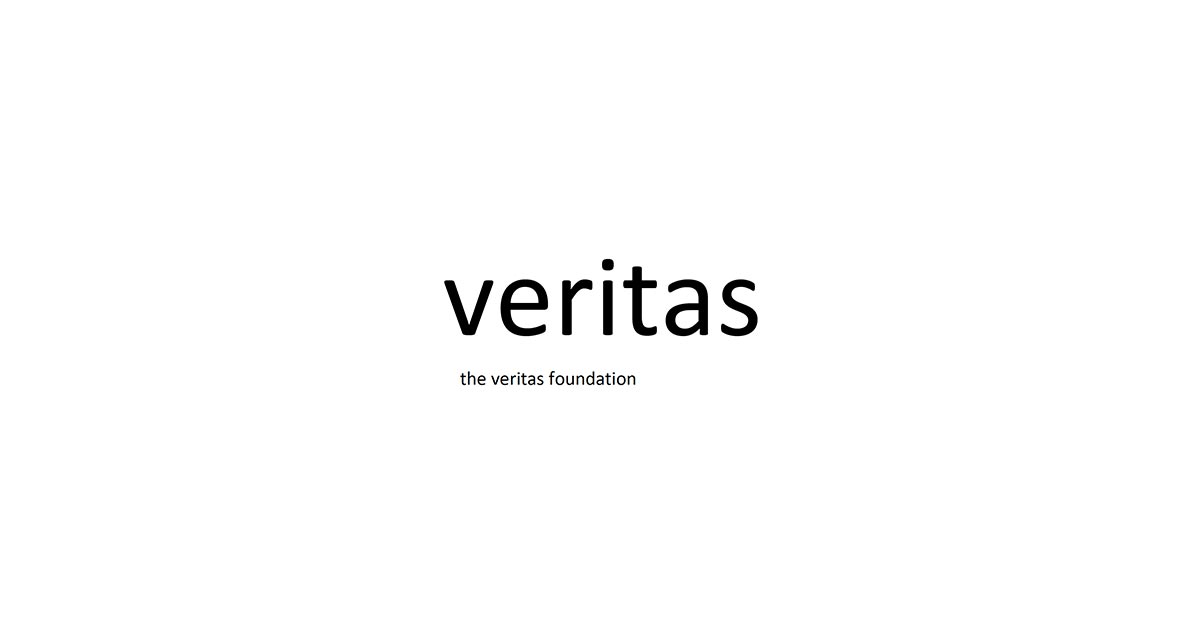
The second, veritas, was meant to make sure that everyone has access to unfiltered truth, and supported news distribution through dropping thumb drives in North Korea and giving impoverished areas internet access. Its creator didn’t have any trouble coming up with the idea.
I’ve always been fascinated with the destructive power of propaganda and the ways people get manipulated.” The logo and brand tone reflected the complete removal from manipulation with simple type and the tagline “truth is self-evident.”
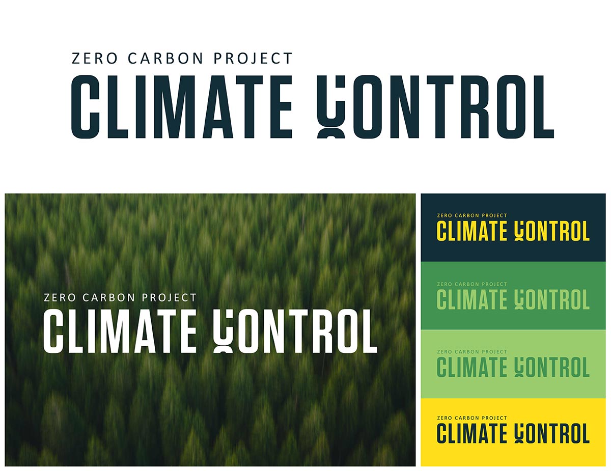
Climate Control, a submission dedicated to stopping severe climate change, took a more serious approach to their branding, for good reason: with the looming threat of our planet being destroyed, Climate Control’s earth tones and bold font depict a sense of urgency to take climate change seriously.
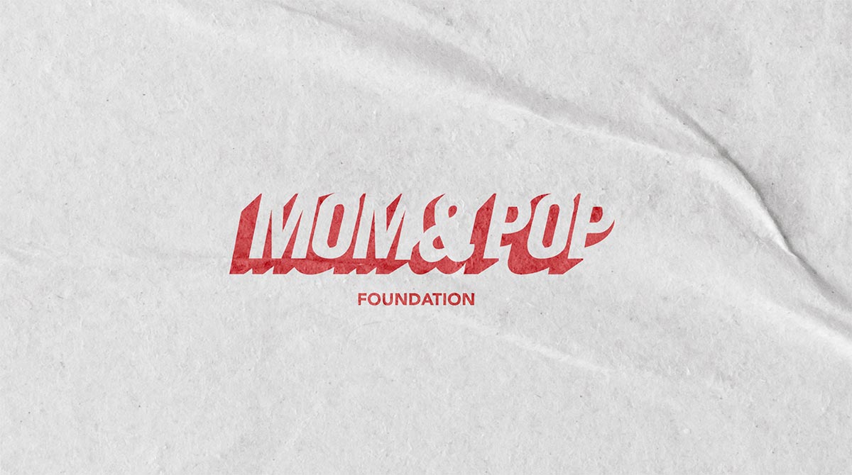
A few submissions leaned on familiarity to shape their branding: The MOM & POP Foundation, for example, vowed to take the power away from conglomerates and give it back to local businesses. The logo? A bold typeface reminiscent of The New York Post.
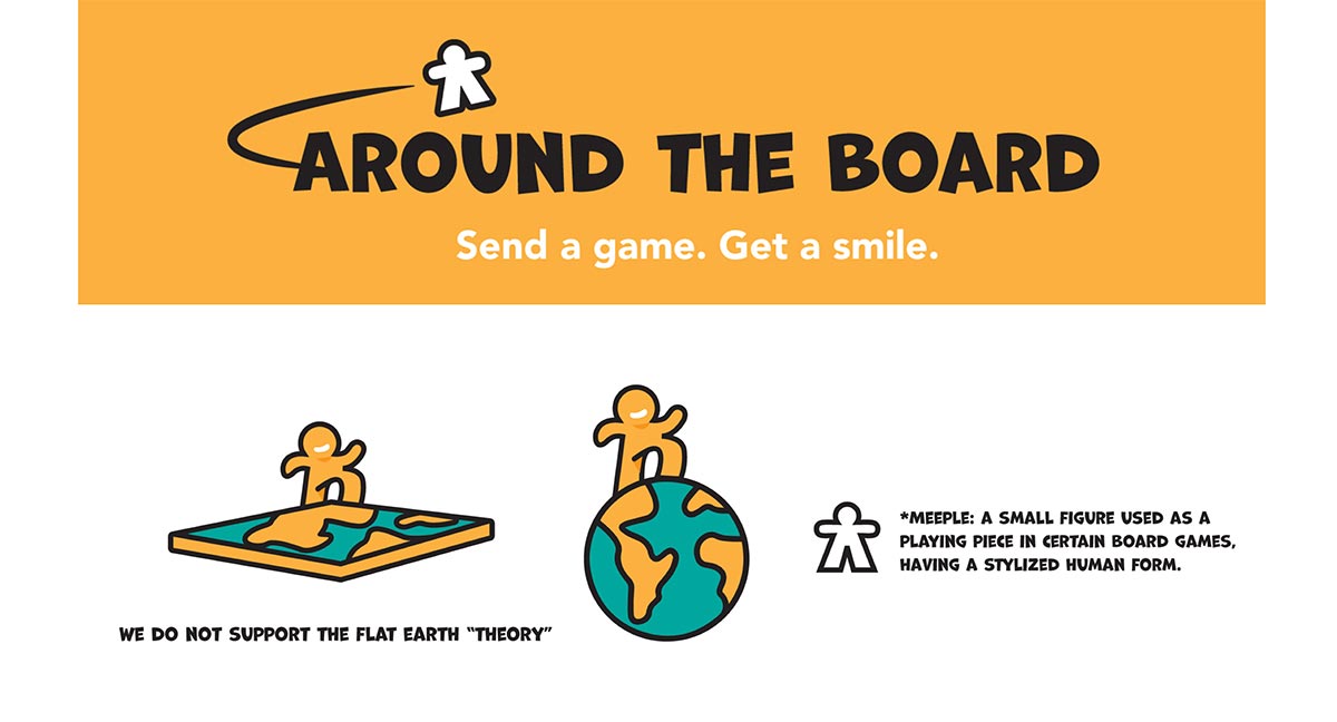
Submissions like Around the Board and Fairly also leaned into what felt familiar or nostalgic. Around the Board, for example, leaned into its lightheartedness as a nonprofit dedicated to collecting and sharing board games for low-income families and sports a stylized “meeple,” or board game piece, as its logo.
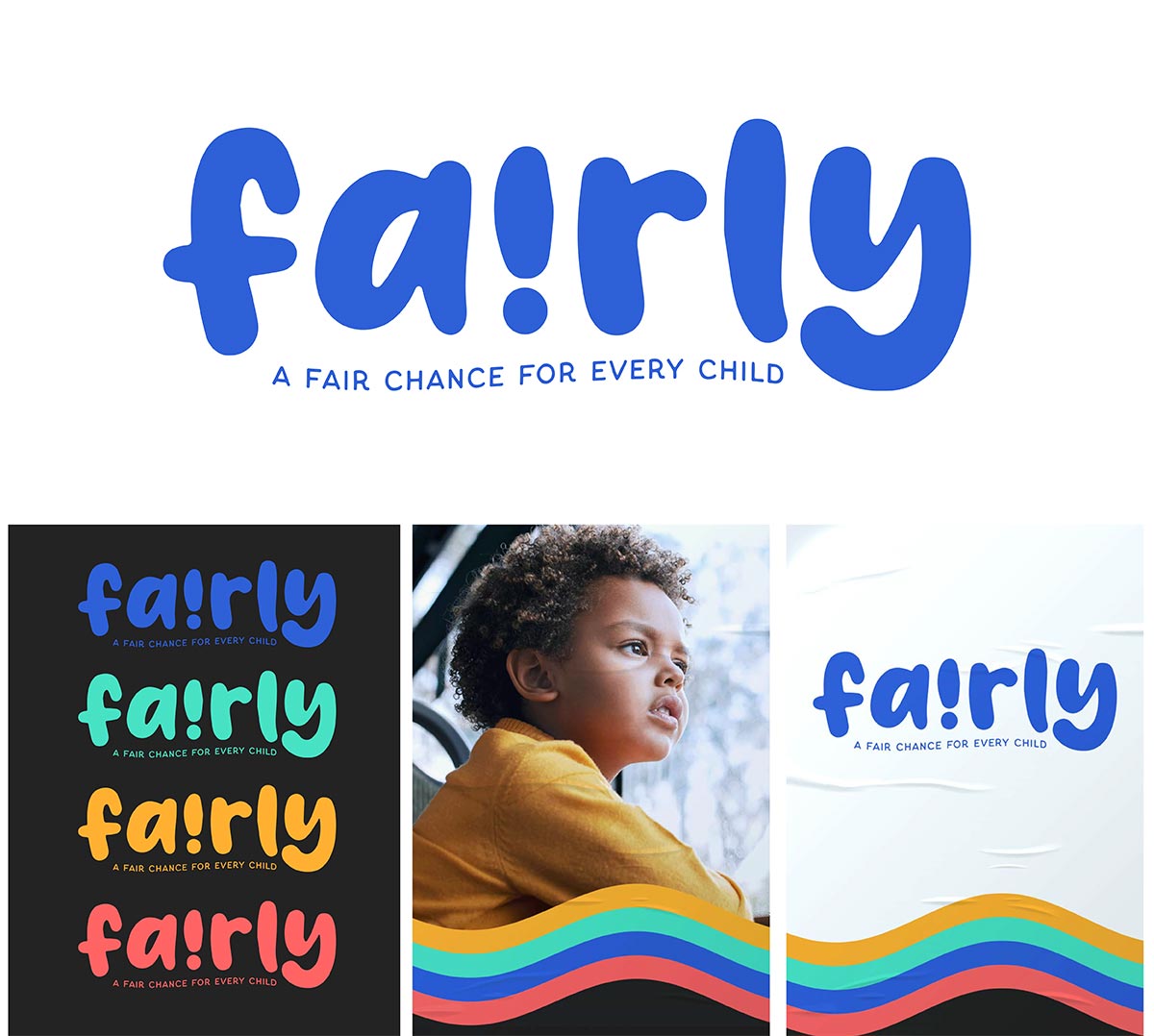
While Fairly isn’t directly based on something audiences have seen before, the logo (along with the typeface and brand colors) evokes a youthful, hopeful tone that immediately lets people know it’s a charity for children.
I thought that building an organization that could serve as a donation hub and distribute funds to smaller nonprofits would help build community and give kids in poverty-stricken areas an equal opportunity.”
Another challenge that some nonprofits face is what the key differentiator will be; how can organizations for issues that technically already exist stand out in the sea of causes and platforms?
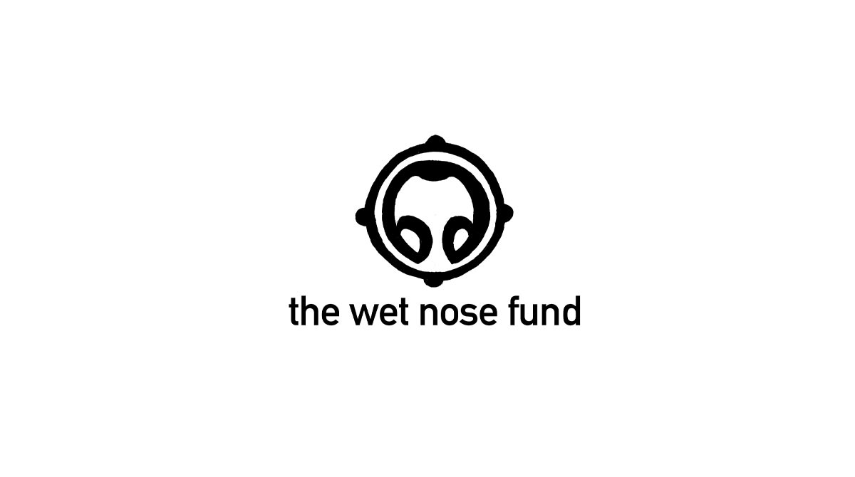
That question is what led one person to craft an abstract “dog’s nose” for her animal welfare organization, aptly called The Wet Nose Fund.
The toughest part about coming up with the idea for The Wet Nose Fund was how to create a simple, visual representation for the charity without being overtly obvious or derivative since there are so many animal welfare and pet organizations out there.”
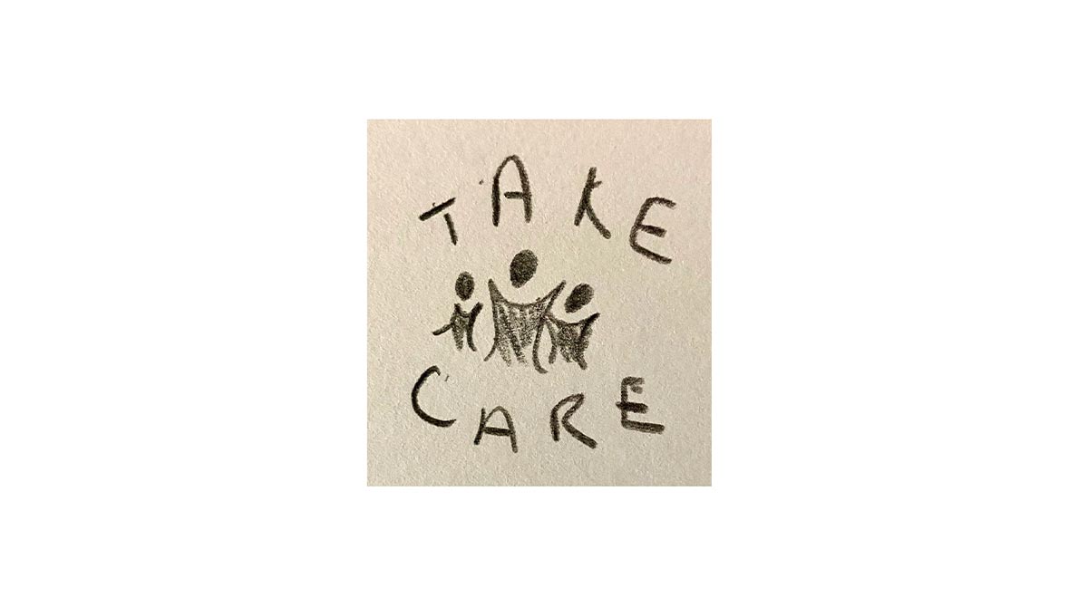
The same issue came up for another Makery member, whose project focused on supporting Black women, nonbinary, and LGBTQ+ people with health and wellness services. She named her organization TAKE CARE and opted for a bold black font, as a nod to the way Black women typically end up as the caretakers of their family structures and a strong command for others to support those who need it most.
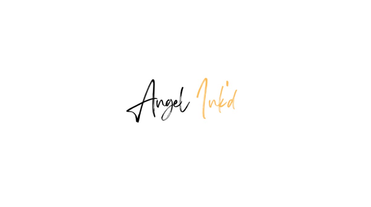
Our final submission wasn’t up against a sea of similar causes. Instead, the cause’s name and logo reflect the mission — connecting tattoo artists with people who have lost their loved ones so that they can get free tribute tattoos — succinctly. A simple name, Angel Ink’d, coupled with a black and orange script logo, gets the job done.
Each submission took our team on a journey of trust, and the project left us feeling ready to launch (and donate to) every charity. It also left us considering how imagining our own nonprofits connects to our client work. Making sure that our nonprofits show up in the world with a clear vision, mission, and identity will ultimately make them more trustworthy, and make audiences more inclined to dive in and help change lives.