

Brand challenge
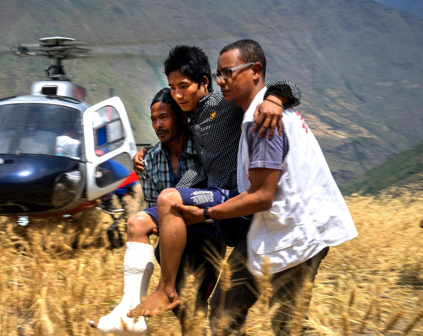
Patient Airlift Services (PALS) was founded in 2010 to help provide free flights to people who need it most. As a volunteer pilot organization, PALS has provided more than 23,000 free flights for patients battling illnesses, veterans in need of supportive services, and victims of natural disasters. PALS came to True North because the brand was not reflecting the care, warmth, and mission of the organization, and was not helping to support efforts to build a new base of donors.
A new brand foundation
Using the tried and true Brand House method, our creative team built the new foundation for PALS to ensure the brand would have a strategically sound positioning, personality, and promise. We identified three pillars of PALS’s work: they connect people to critical lifesaving care, provide a nurturing experience that eases a patient’s burden, and represent a trusted network of pilots. These pillars translate into three core personality traits for PALS: devoted, optimistic, and reliable. And the brand promise surfaced: Going above and beyond to lift people up.
The visual identity
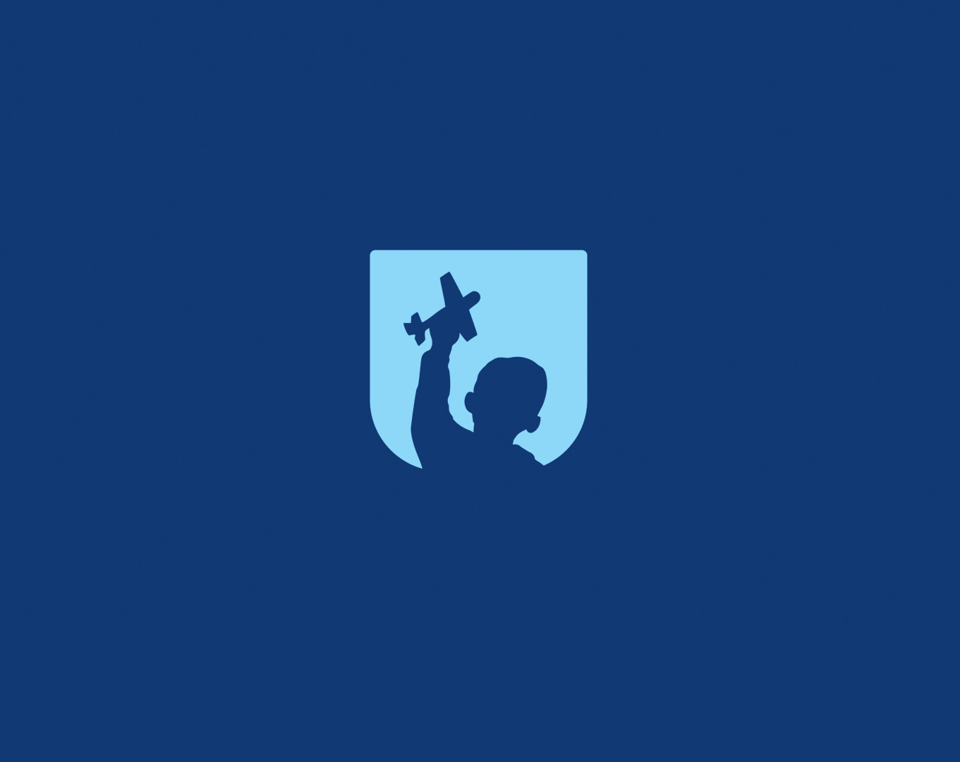
The PALS visual identity needed modernizing, but it also had to reflect the new brand strategic foundation. True North’s team created a logo that differentiates PALS from other volunteer pilot organizations, as it focuses on the people PALS serves instead of solely using aviation iconography.
![]()
The new logo brings a renewed sense of warmth and optimism to PALS.
The logo icon builds a narrative around the PALS brand. The child represents PALS passengers, but the silhouette piques the curiosity of who the child is and their story. The badge shape is representative of a plane window with the shade up. The child holds a toy plane in the air with an upward gaze. The imagination of a brighter future and the hope of what a flight can bring fill the brand with optimism.
![]()
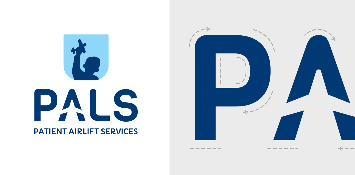
The new PALS wordmark is composed of a custom type design that combines rounded and hard edges to balance the brand’s personality traits, and it creates a rising plane shape in the negative space of the A. The wordmark and icon work together in a side-by-side orientation or stacked. The PALS blue palette represents optimism (sky blue) and reliability (dark blue).
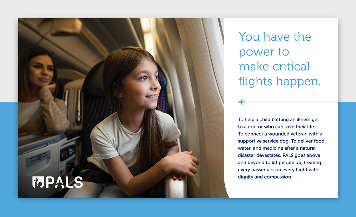
Our team overhauled the messaging strategy for PALS to deliver a strong case for support for the organization. The brand promise is delivered through the eyes of a prospective donor and how their support can make a difference for people who need critical flights.
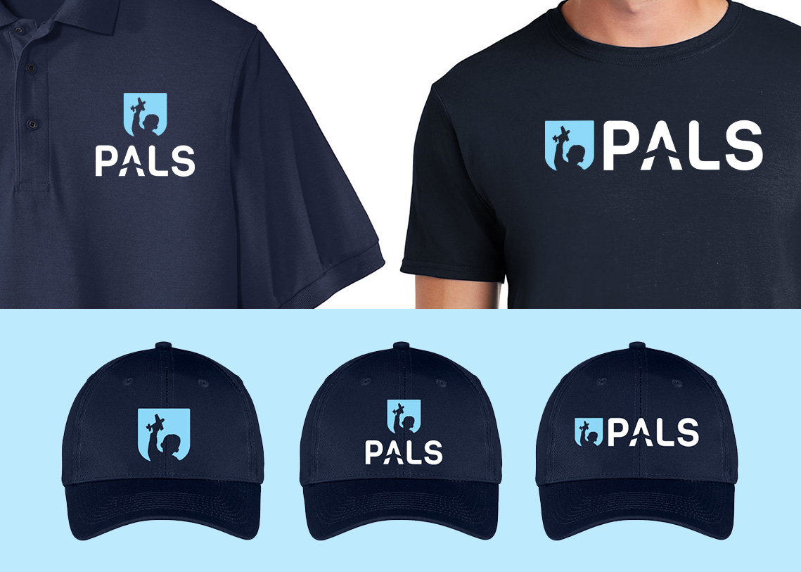
The new brand identity for PALS is an exciting mix of modern design, handcrafted art, and emotive symbolism. The logo form was developed as a strong emblem and when emblazoned on a hat, shirt, or tail fin, it communicates a strong and caring brand that is worthy of your support. And it generates a sense of pride when worn by a heroic PALS pilot.
BROWSE MORE WORK